노력이 좋아서
<step66>'react_styledcomponents'
zoaseo
2022. 6. 23. 14:00
1)
App.js
import './App.css';
import styled from 'styled-components';
import Button from './components/Button.js';
import Dialog from './components/Dialog.js';
import { useState } from 'react';
import Box from './components/Box';
const AppBlock = styled.div`
width: 512px;
margin: 0 auto;
margin-top: 50px;
border: 1px solid black;
padding: 10px;
`
const Circle = styled.section`
width: 100px;
height: 100px;
background: ${props=> props.color || 'black'};
border-radius: 50%;
`;
function App() {
const [ dialog, setDialog ] = useState(false);
const onClick = () => {
setDialog(true);
}
const onCancel = () => {
setDialog(false);
console.log('취소');
}
const onConfirm = () => {
setDialog(false);
console.log('확인');
}
return (
<div className="App">
<Circle color="blue"/>
<Circle/>
<Circle color='pink'/>
<AppBlock>
<Button>button1</Button>
<Button>button2</Button>
<Button onClick={onClick}>button3</Button>
</AppBlock>
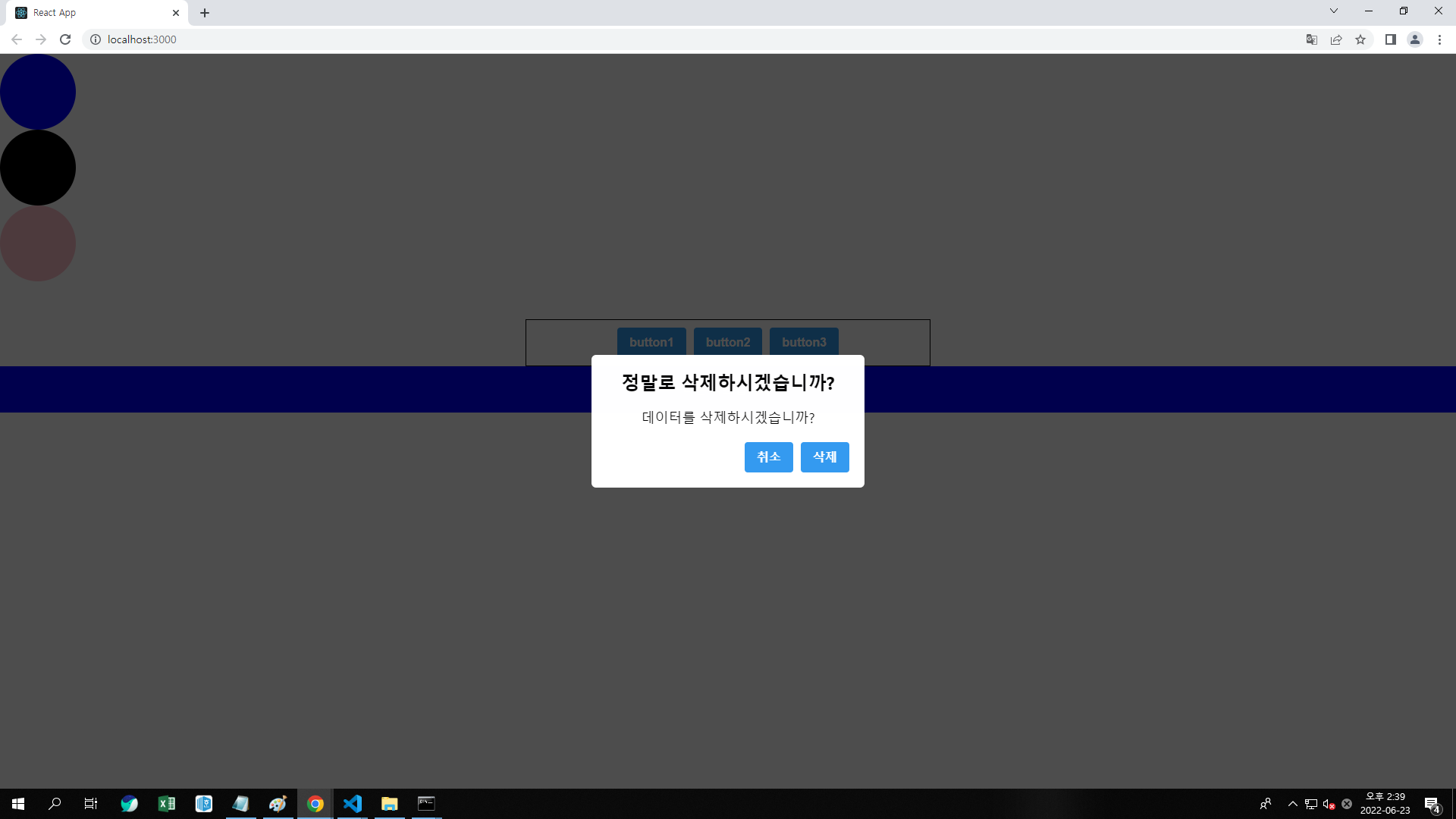
<Dialog title="정말로 삭제하시겠습니까?"
confirmText="삭제" cancelText="취소"
visible={dialog}
onCancel={onCancel} onConfirm={onConfirm}>
데이터를 삭제하시겠습니까?
</Dialog>
<Box/>
</div>
);
}
export default App;
Button.js
import React from 'react';
import styled from 'styled-components';

const StyleButton = styled.button`
    /*공통스타일*/
    display: inline-flex;
    outline: none;
    border: none;
    border-radius: 4px;
    color: white;
    font-weight: bold;
    padding: 0 16px;
    line-height: 40px;
    font-size: 16px;
    background: #339af0;
    &:hover {
        background: #1c7ed6;
    }
    &+& {
        margin-left: 10px;
    }
`
const Button = ({children, onClick}) => {
    return (
            <StyleButton onClick={onClick}>{children}</StyleButton>
    );
};

export default Button;
Dialog.js
import React from 'react';
import styled from 'styled-components';
import Button from './Button';

// 어두운배경 div
const DarkBackground = styled.div`
    position: fixed;
    left: 0;
    top: 0;
    width: 100%;
    height: 100%;
    display: flex;
    align-items: center;
    justify-content: center;
    background: rgba(0,0,0,0.7);
`;
// 컨텐츠 블럭
const DialogBlock = styled.div`
    width: 320px;
    padding: 20px;
    border-radius: 6px;
    background: #fff;
    h3 {
        margin: 0;
        font-size: 24px;
    }
    p {
        font-size: 18px;
    }
`
// 버튼그룹
const ButtonGroup = styled.div`
    margin-top: 20px;
    display: flex;
    justify-content: flex-end;
`
const Dialog = ({title, children, confirmText, cancelText, visible, onCancel, onConfirm}) => {
    if(!visible) return null;
    return (
        <div>
            <DarkBackground>
                <DialogBlock>
                    <h3>{title}</h3>
                    <p>{children}</p>
                    <ButtonGroup>
                        <Button onClick={onCancel}>{cancelText}</Button>
                        <Button onClick={onConfirm}>{confirmText}</Button>
                    </ButtonGroup>
                </DialogBlock>
            </DarkBackground>
        </div>
    );
};

export default Dialog;
Box.js
import React from 'react';
import styles from './Box.module.css';

const Box = () => {
    return (
        <div className={styles.Box}>
            나는 박스입니다.
        </div>
    );
};

export default Box;
Box.module.css
.Box {
    background: blue;
    color: #fff;
    padding: 20px;
}